MOBILE APP MVP
Rec
Rec is an iOS mobile app MVP that helps people to easily log and exchange credible and comprehensive recommendations from their friends.
This is a solo student project for DesignLab UX Academy, completed within 80 hours.
Background
What sparked this project was a trip that I was planned to San Diego. As it was my first time going to San Diego, I wanted to leverage my network by asking for recommendations on the best places to stay, visit and eat at. From this thought exercise I noticed 2 problems:
Problem 1
Who should I ask for recommendations from?
Problem 2
How should I best organize the recommendations I receive?
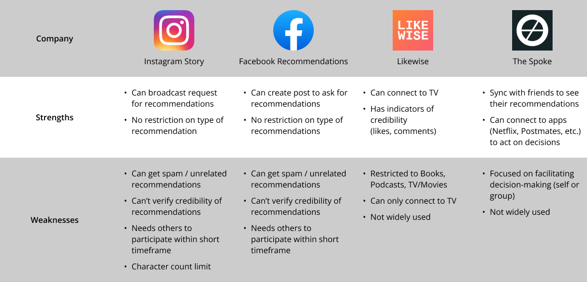
Competitive Analysis
To learn about existing solutions in the “Recommendations” space, I read forums and asked friends about how they currently get recommendations.
User Research
I conducted 26 user surveys to uncover behavioral patterns to validate my assumptions, and 5 user interviews to get anecdotal data. I wanted to understand:
- How users currently give and receive recommendations
- Why and how users store both recommendations that they give and receive
- What challenges users face when they seek or give recommendations
- Why users value recommendations from friends or family
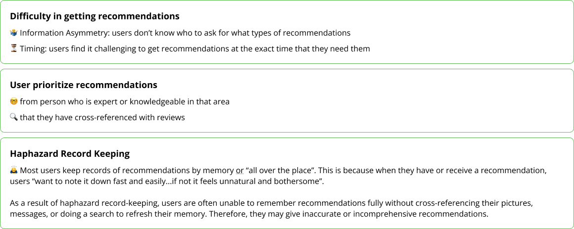
Upon organizing the data through affinity mapping, 3 main insights stood out:
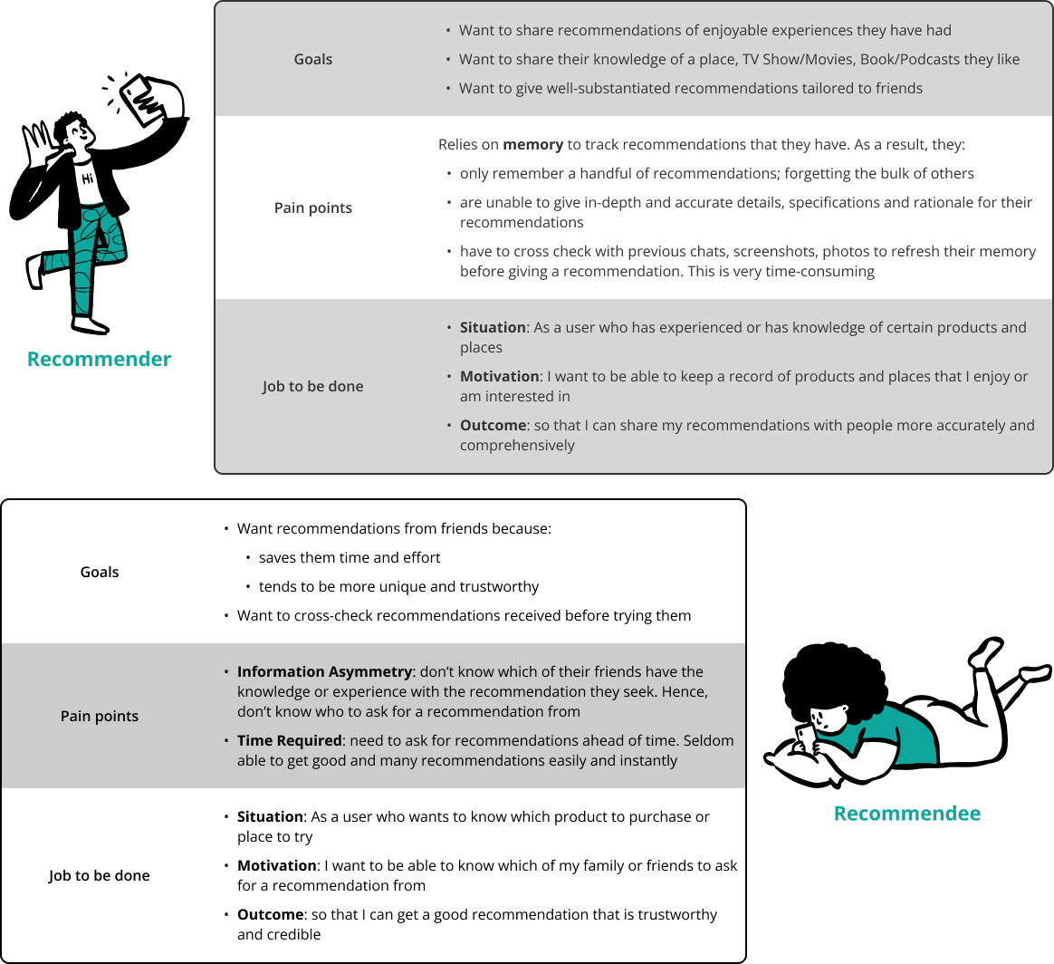
User Personas & HMW
To accurately represent my users, I created personas representing both ends in the exchange of recommendations; a Recommender and a Recomendee.
"How Might We" (HMW) Statement
How might we facilitate the exchange of recommendations between people seeking for recommendations and
people who have the knowledge or experience to give that recommendation?
Prioritization & Roadmapping
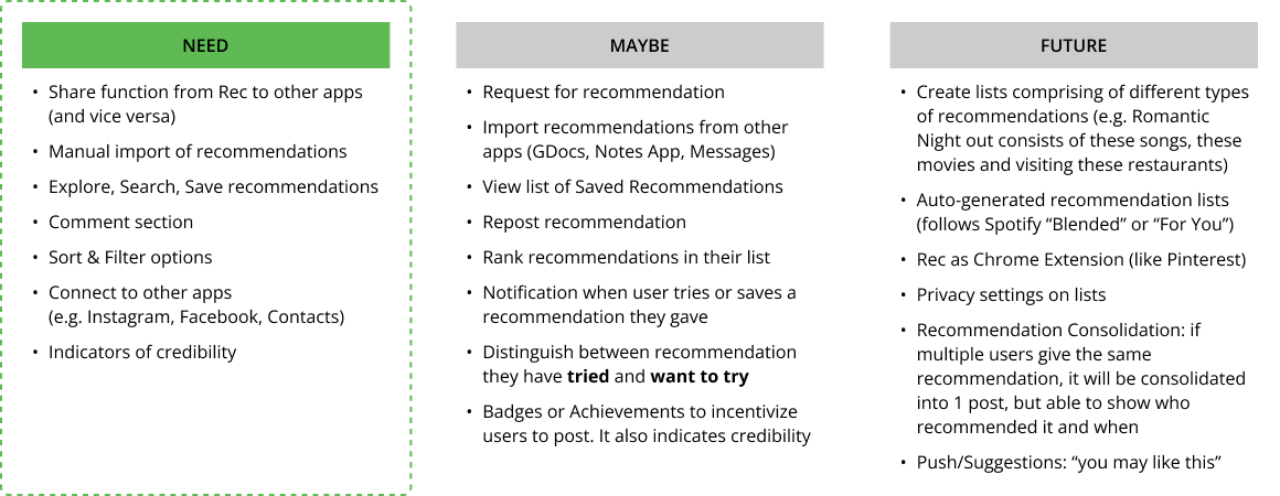
Using the HMW Statement and “Jobs to be Done”, I ideated widely about possible solutions and features. From there, I narrowed down the crucial task flows and corresponding features required for the minimum viable product to address the “Jobs to be Done”.
Feature Prioritization
I prioritized the features by grouping them into Need, Maybe and Future. If time permits, I could look into the "Maybe" list to consider features I could further incorporate.
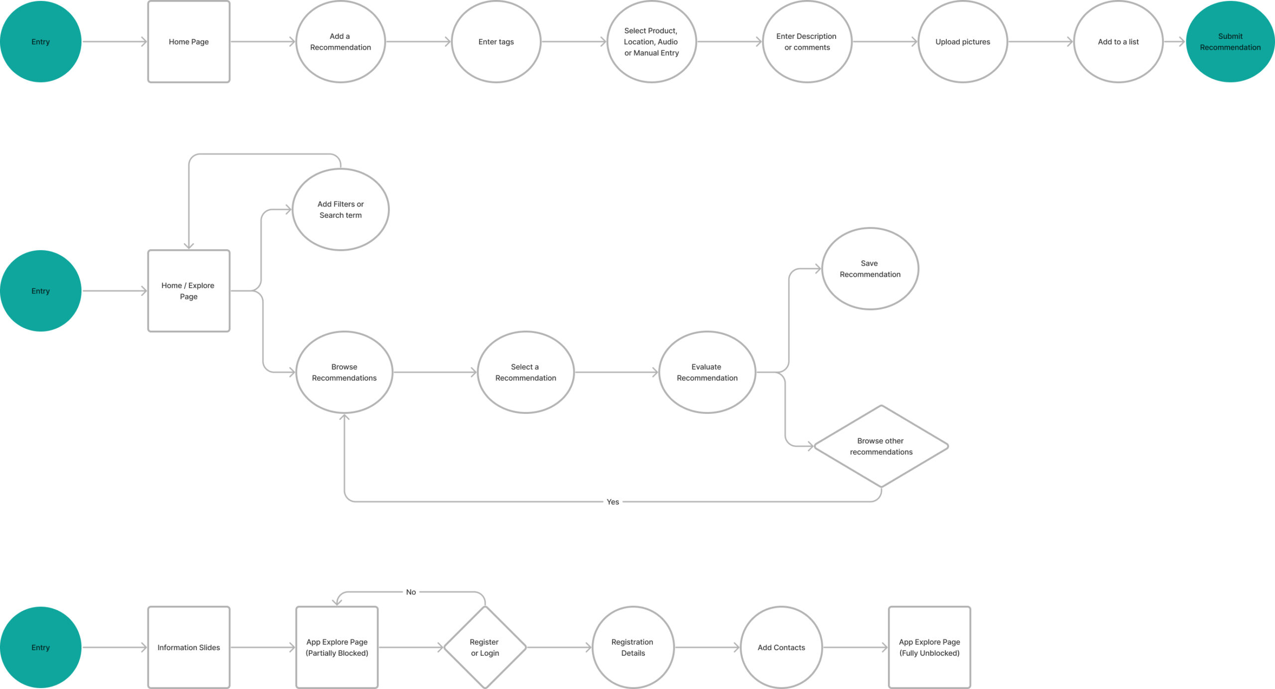
Task Flows
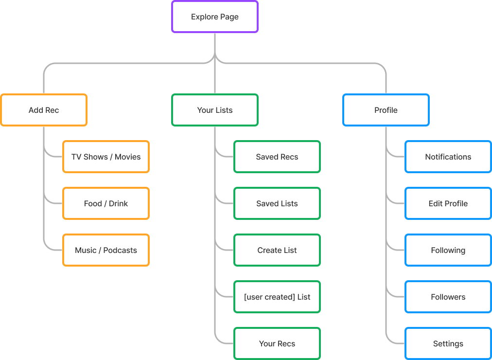
Sitemap
Low & Mid-Fidelity Wireframes
I created rough sketches and wireframes to piece the features and task flows together.
Design Principles
Since the concept of the mobile app has a community & social-sharing aspect, I wanted to ensure that I was creating an enjoyable and intuitive user experience. Therefore, I focused on 3 design principles that I wanted to implement in my designs.
1. User Control
To encourage easy navigation and exploration of the app, user control and freedom is crucial. I included options for users to go back, skip content, cancel and undo their actions.
2. Consistency
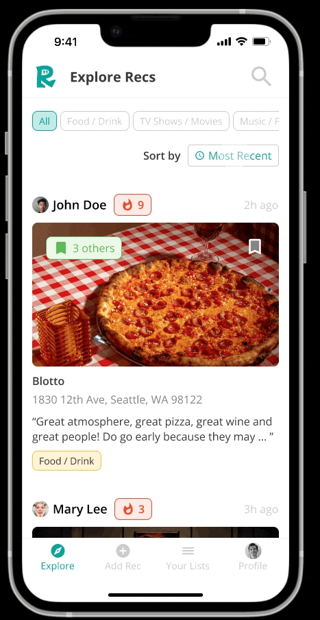
To increase learnability and reduce confusion, I used patterns, icons and positions consistent with well-established conventions.
This enables users to focus on using the app to exchange recommendations instead of expending time and effort to familiarize themselves with the app. For example, placing the "Sort by" feature in the top right hand corner of the screen, and having the options modal move in from the bottom centre of the screen.
3. Feedback
I wanted the user experience to be enjoyable to keep users engaged.
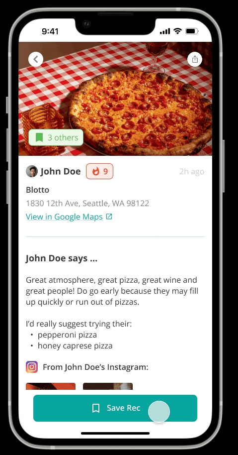
To feedback to users that their action has been implemented (e.g. "Save Rec"), I designed a changed state of the button and a disappearing pop-up modal with a success message.
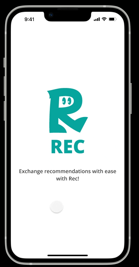
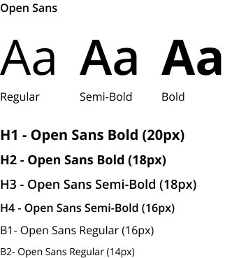
I also implented an animated loading screen to provide feedback to users that they launched the Rec app and are moving between apps. Beyond providing feedback, the animated loading screen reinforces the app's brand identity and makes the loading duration enjoyable.
Usability Test
I ran both unmoderated usability tests (via Maze) and moderated usability tests to get feedback on Rec. I gave testers a scenario before they attempted to complete each of the 5 tasks, which took testers through the 3 task flows.
- Task 1: Registering an account with Rec and following friends using the app
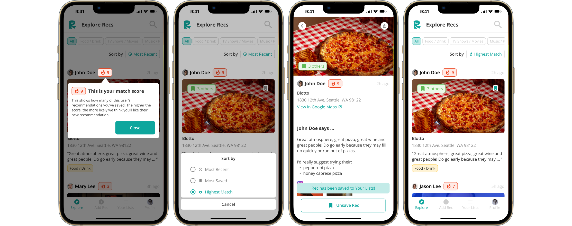
- Task 2: Sorting recommendations from highest to lowest match
- Task 3: Saving a recommendation
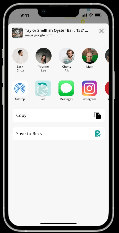
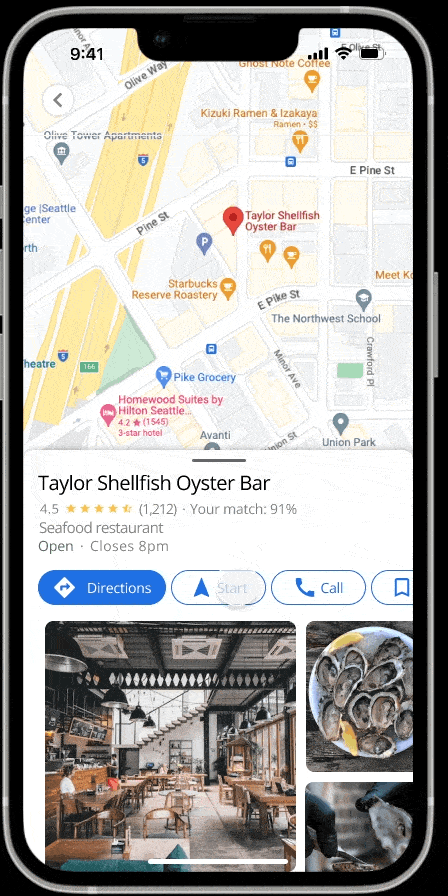
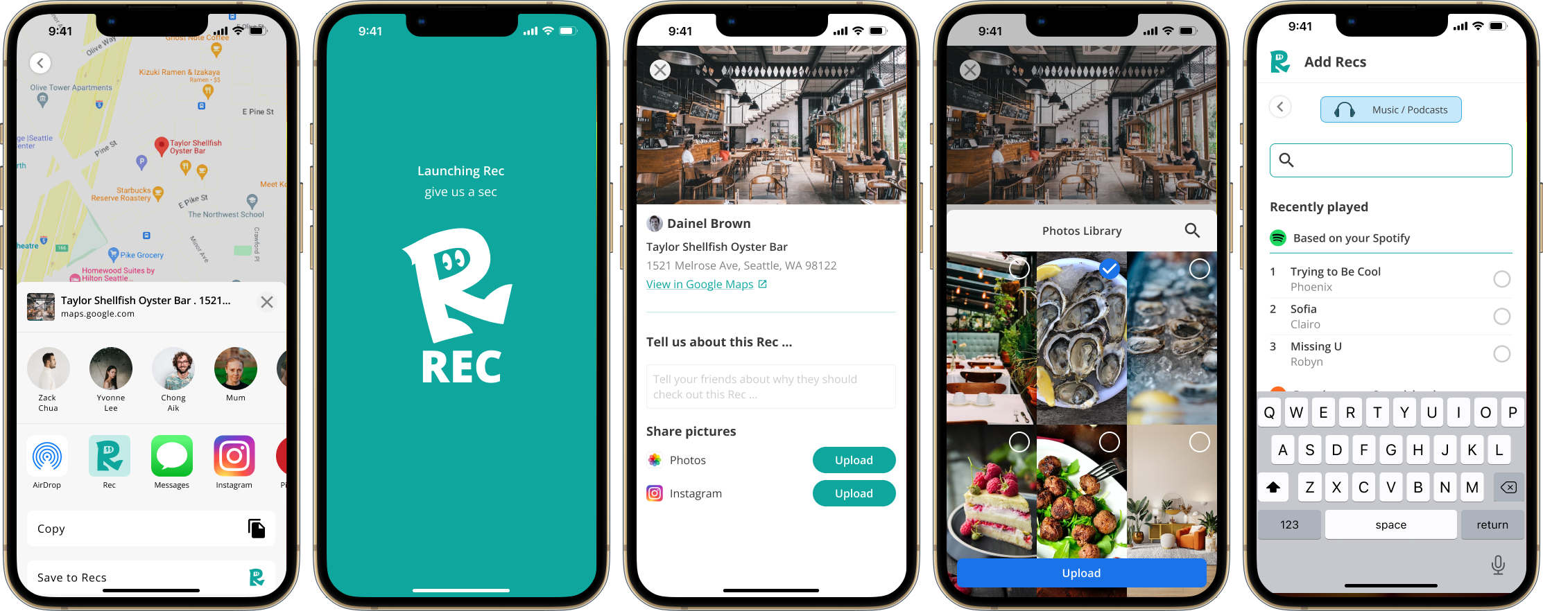
- Task 4: Adding a recommendation from Google Maps
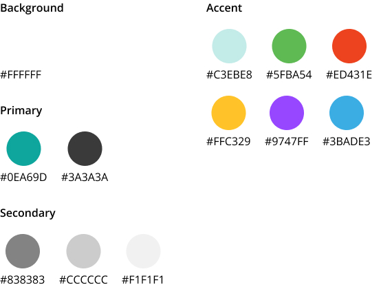
- Task 5: Adding a recommendation from the Rec App
Overall, testers gave feedback that the app was straightforward, intuitive and satisfying to use. For all the tasks, all testers ranked the difficulty of tasks between 0 to 3 (0 being easy, 10 being hard). Some constructive suggestions I received include:
- Onboarding or modals to explain the meaning of icons and features, and how to activate them
- Reconsidering some copywriting for clarity
- Reconsidering color of "Saved" icon to make it more prominent and visible
Iterations
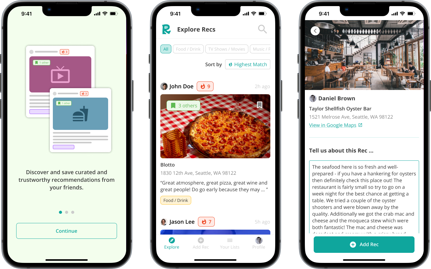
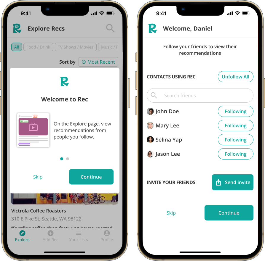
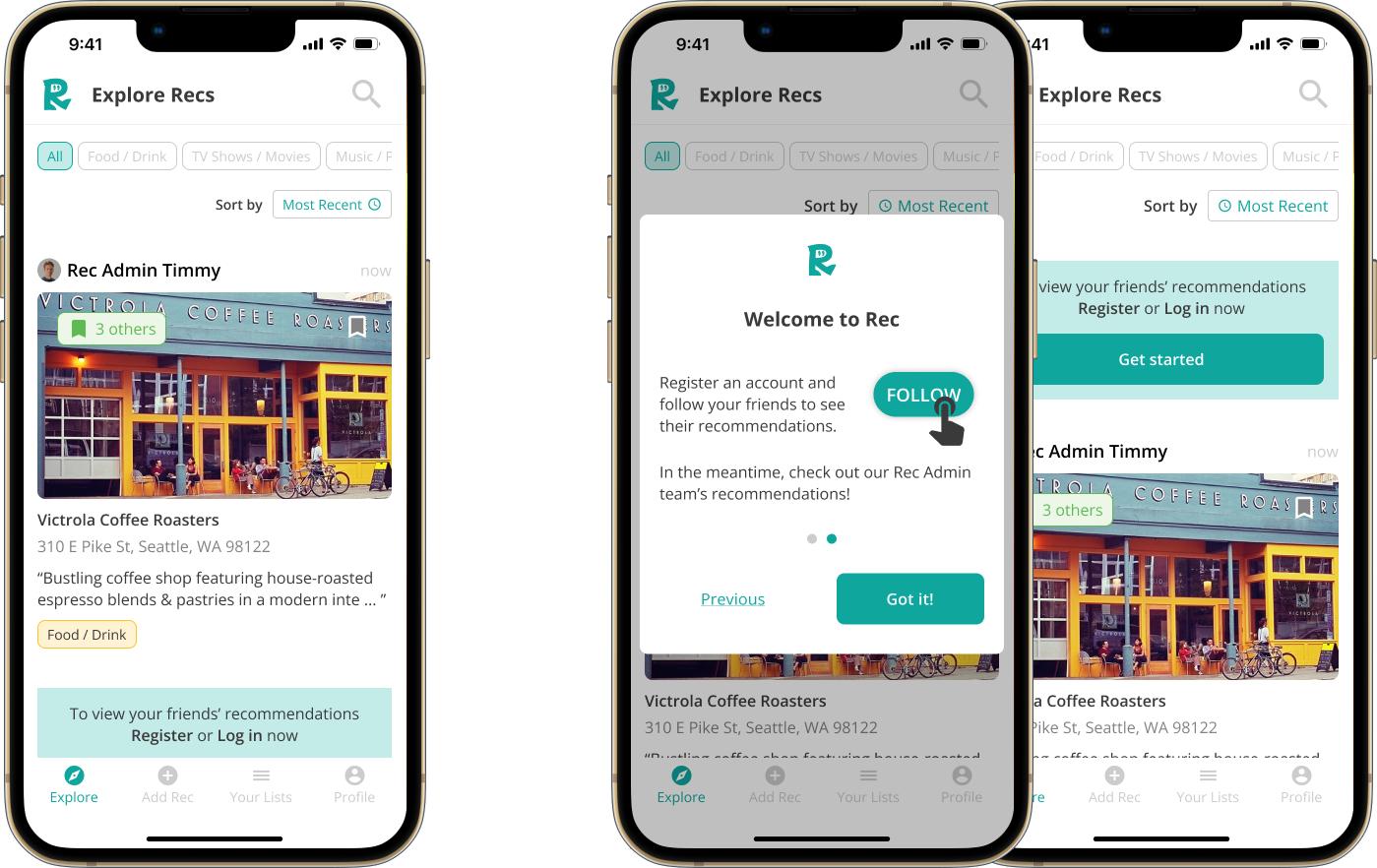
Introduction Modals
To lower the interaction cost and barriers to use, I wanted to enable users to trial using the app, before having to commit to registering an account.
However, testers gave feedback that they had anticipated a "login wall" and consequently felt disoriented on the homepage.
To address this, I introduced modals with microcopy to prompt users to register an account.
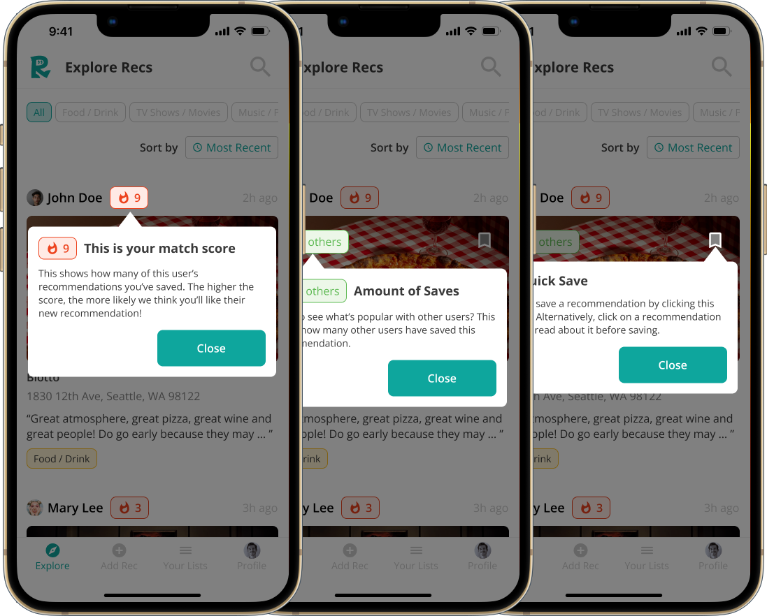
Tutorial Modals
Testers had difficulty deducing what the various icons and features (e.g. "🔥 Highest Match") meant. This impaired users' understanding of how the app works.
To address this, I included a tutorial explaining the key features on the page to kickstart users' understanding of the app. I kept the tutorial concise (3 pages) to keep users engaged and minimize cognitive load.
High-Fidelity Wireframes
Prototype
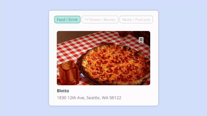
Key Screens
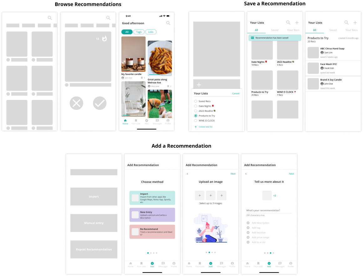
Onboarding Flow
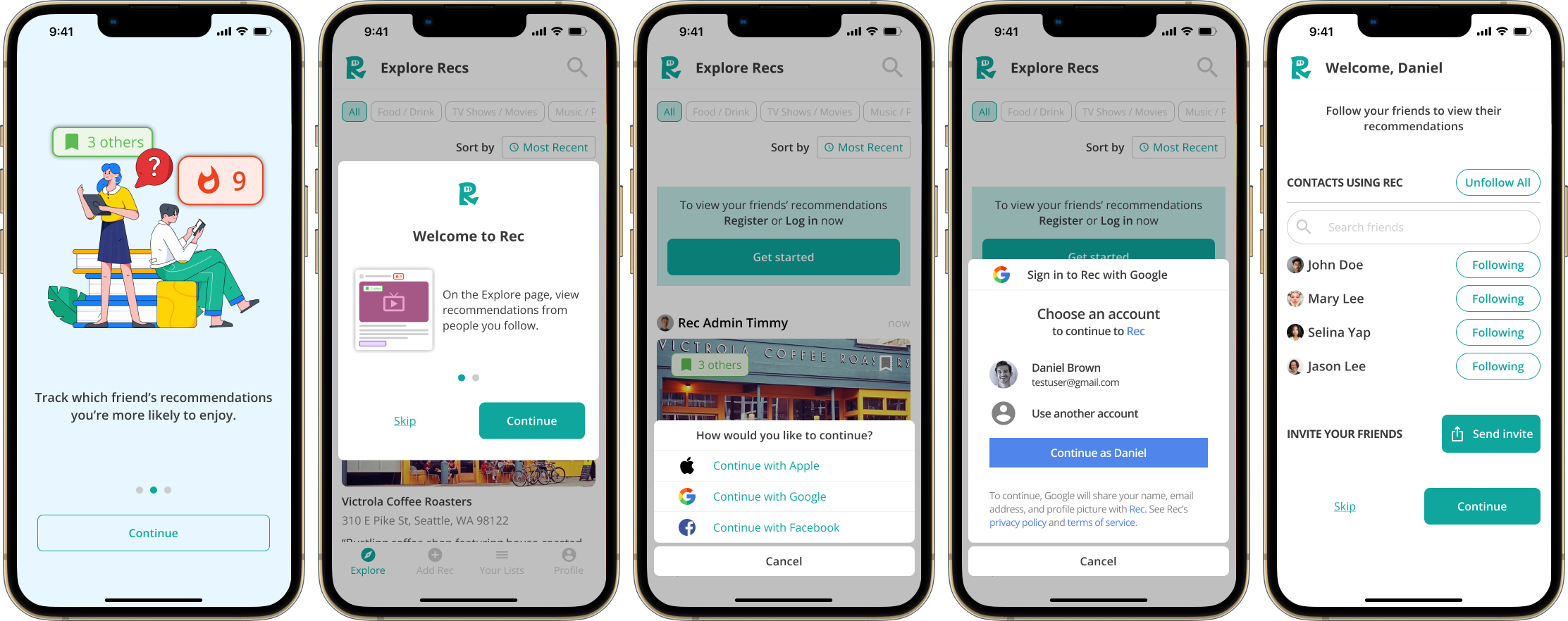
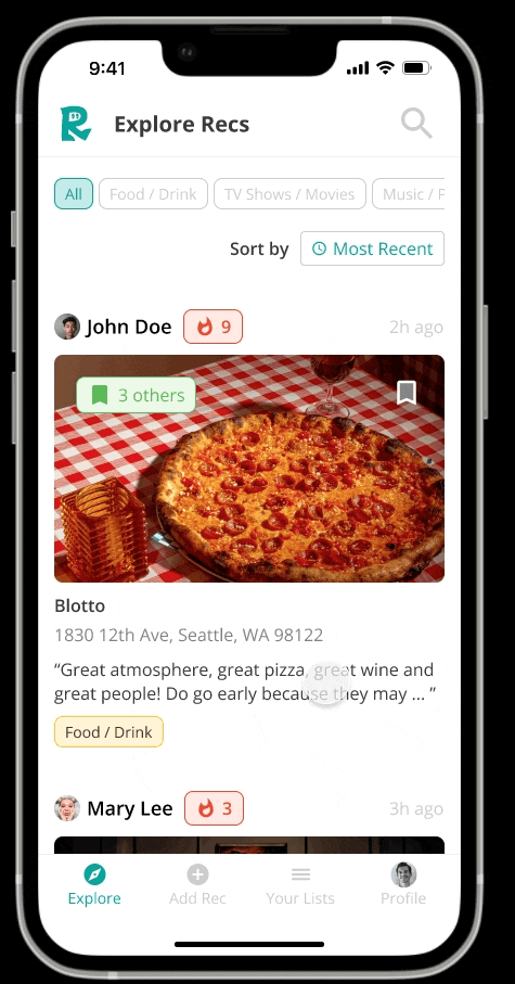
Browse & Save a Recommendation
Add a Recommendation
UI Elements
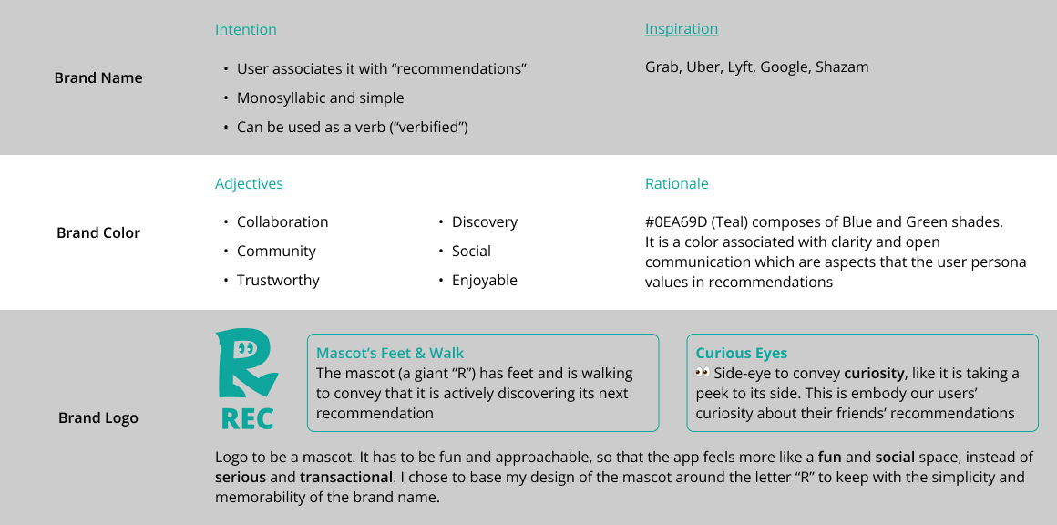
Style Guide
TYPEFACE
COLOR PALETTE
BRAND LOGO

FORMS
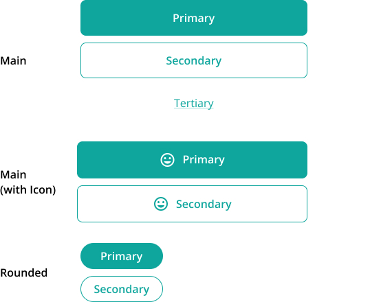
BUTTONS
Branding
What I learned
Through this project, I learnt the importance of having a basic understanding of technical capabilities.
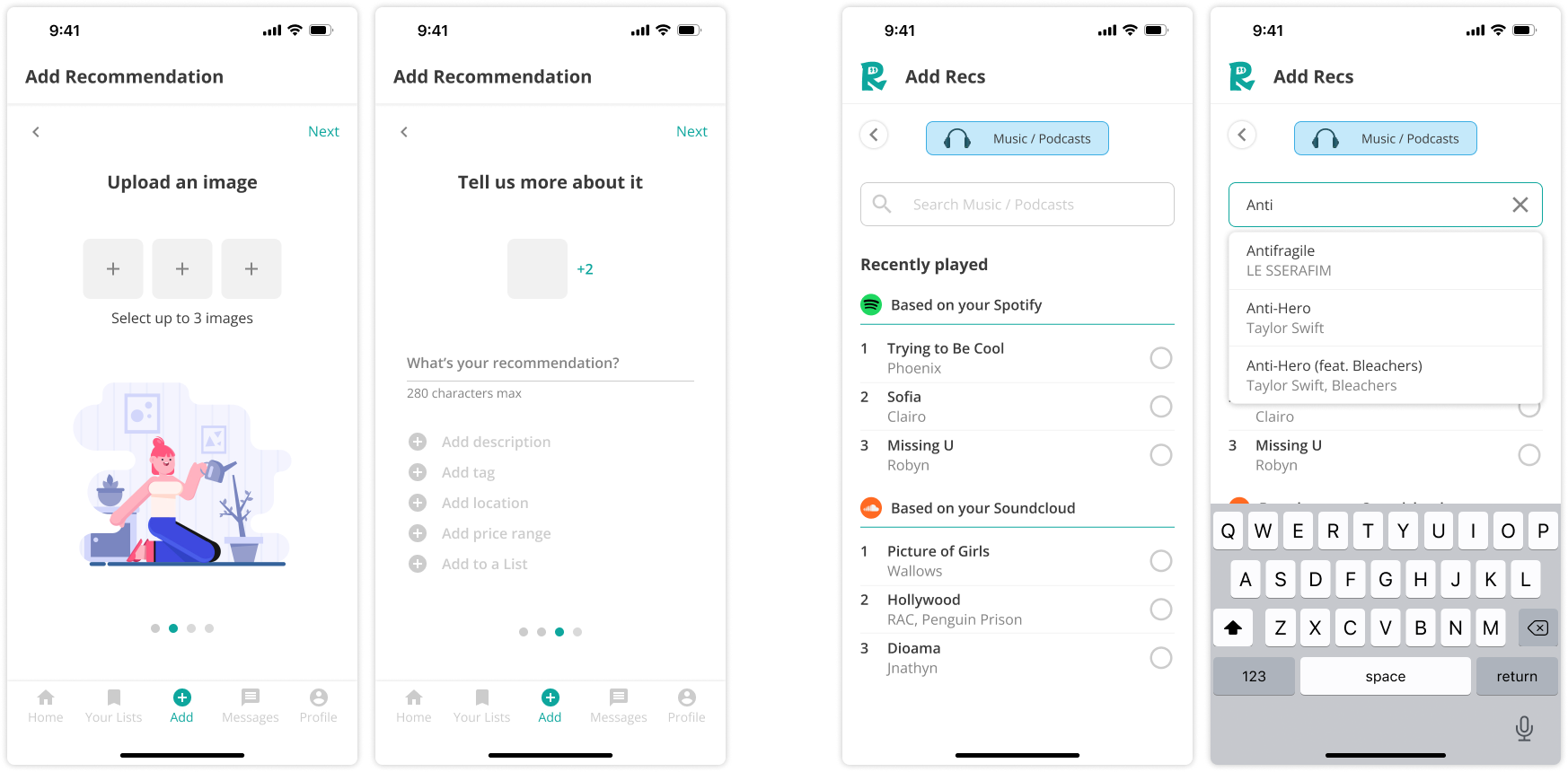
In my initial design, to "add a recommendation" users had to manually key in the recommendation information, location, tag and upload a picture of it. This design was inefficient and would not realistically be used by users.
Upon receiving feedback to consider the user flows in other apps, I considered different APIs which could make the user experience much faster, more accurate and usable. This changed my entire design and task flow!
view other projects
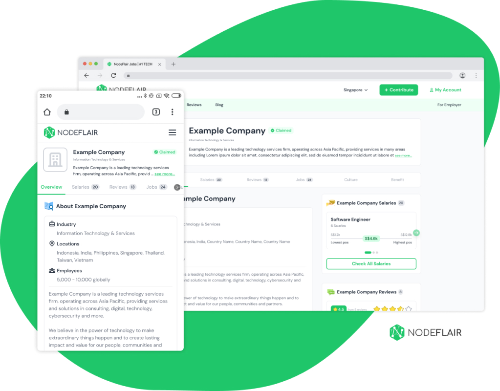
NodeFlair: Company Profile pageUX Design Internship (2022-2023)
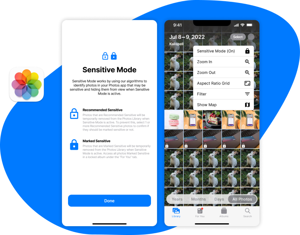
Sensitive ModeAdding a new feature to Apple Photos (Student Project)
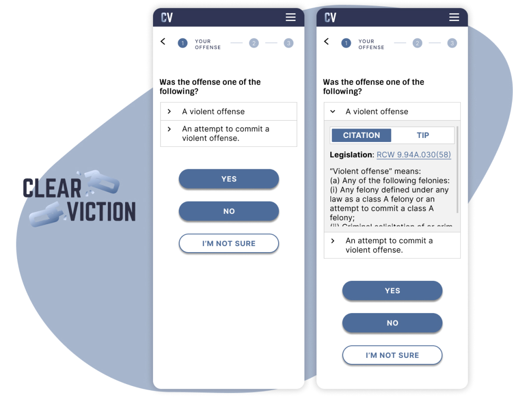
ClearvictionMobile redesign of conviction vacation calculator (Pro-Bono)