Clearviction
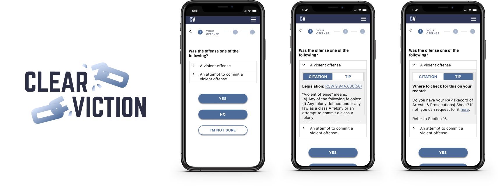
Redesigned the UX for how references to and definitions of legal code are shown to users in the eligibility calculator, streamlining the UI and making the overall experience less intimidating.
Clearviction is a 501(c)(3) non-profit, comprising of an all-volunteer agile team. Our goal is to help people easily navigate the legal system in Washington State and seal their records so they face less barriers to housing, employment, education, and government assistance. We launched our current product, the eligibility calculator in May 2022, that enables users to determine eligibility to vacate their conviction.
I joined Clearviction as a Product Designer in February 2022 and am currently part of the Product Team.
Problem
Based on user feedback, the product team identified that the presentation of content on the eligibility calculator was intimidating and difficult to understand which led to drop-off in usage as users were unable to complete the process.
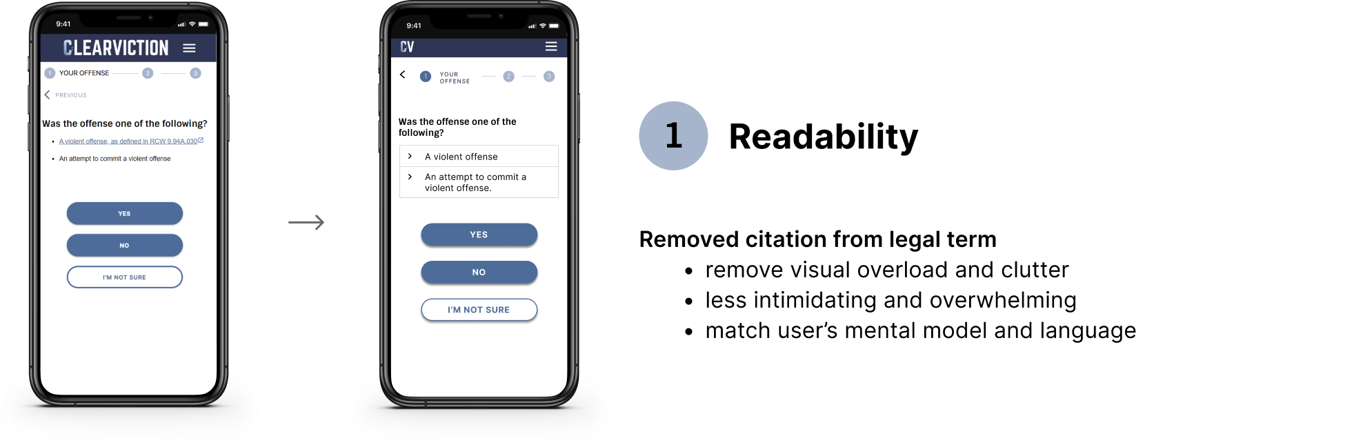
The hypothesis was that if we display RCW (Washington Legal Code) links differently, the calculator will be less intimidating and more users will be able to complete the process and attain a result.
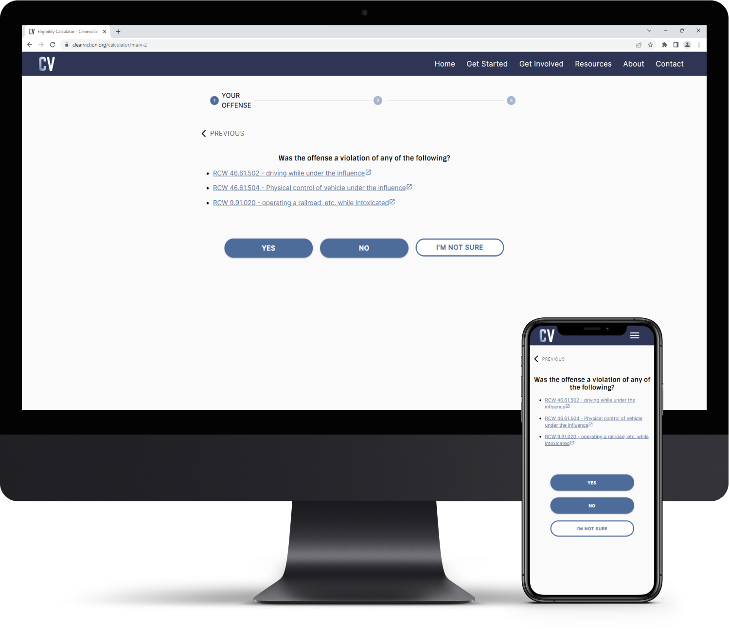
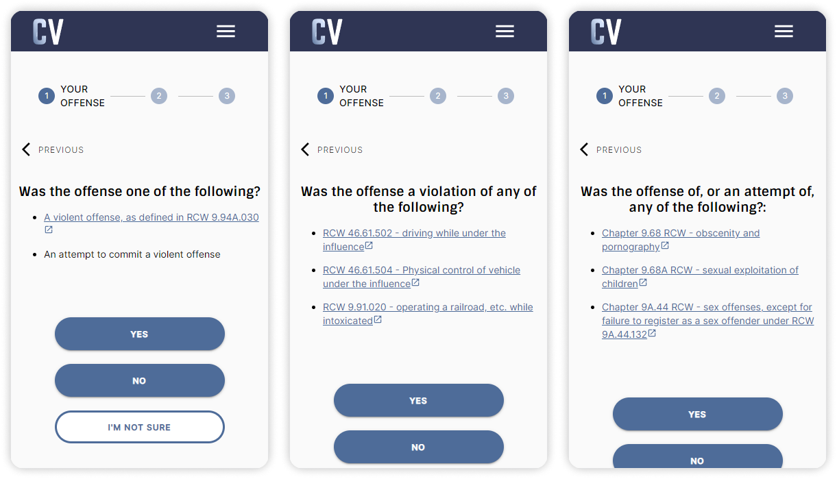
The Final Product
Understanding Our Users
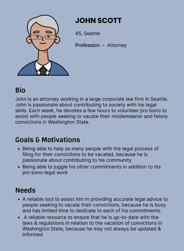
Since launching in May 2022, we have had the opportunity to speak with and receive feedback from some of our users. With this information, we have refined our user personas.
The user personas that we identified are self-help users and users that use our product to help others determine their eligibility to vacate their conviction.
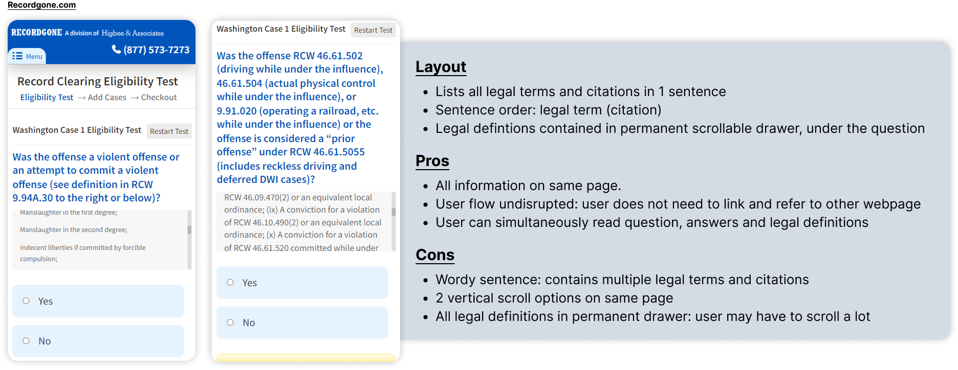
Legal Content Issues
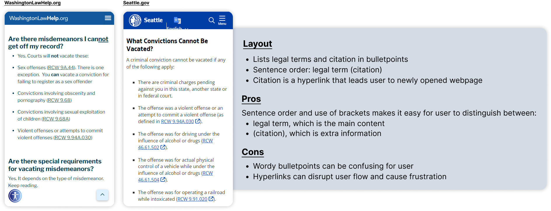
Inconsistent and complex wording
Going through the eligibility calculator, I discovered heuristic violations:
- The order of legal terms and citations was inconsistent across questions.
- Language does not match the user's mental model: most users do not know their exact offense and legal citation.
- Too wordy: content easily overwhelms users.
Disrupted user flow
Moreover, I found the process of clarifying legal terms frustrating!
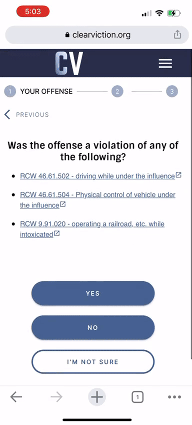
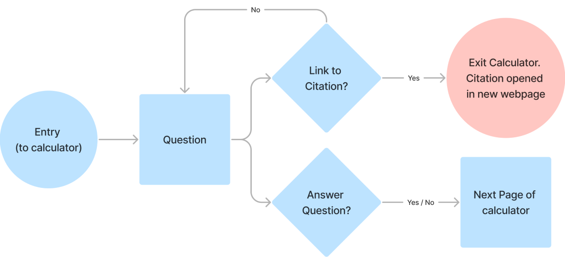
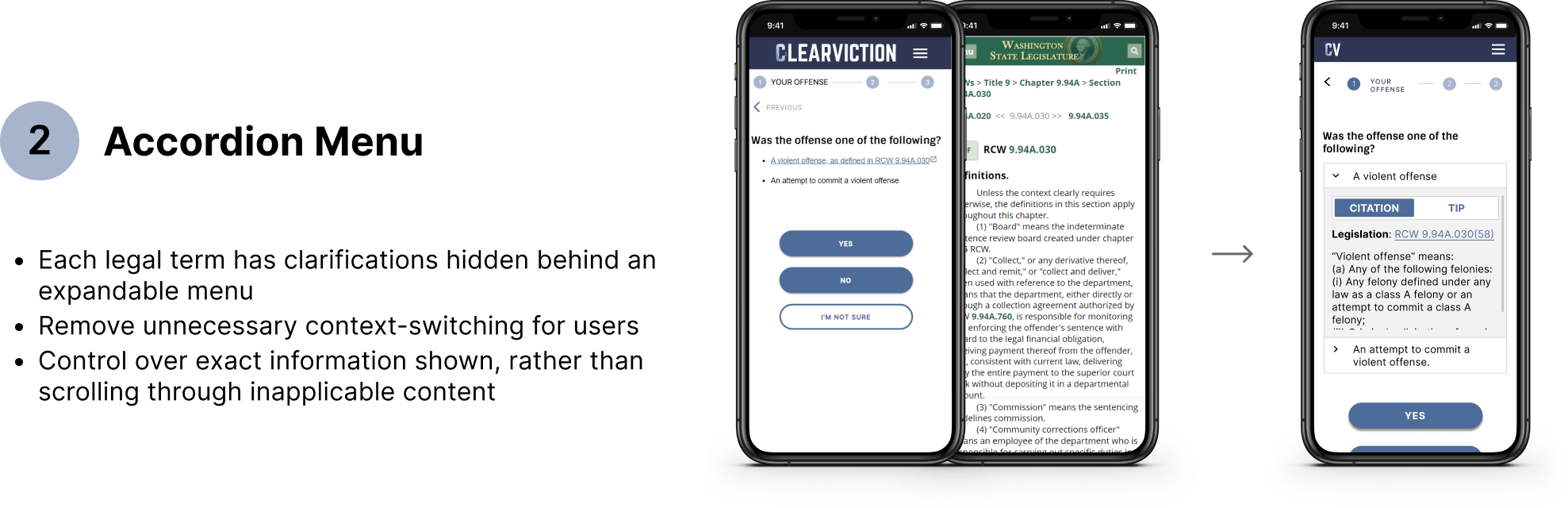
To clarify a legal term, a user must click on the associated hyperlink which will open the citation in a new tab. This disrupts the user flow and makes it cumbersome for the user to return to the calculator - which could result in users abandoning the product. Opening a new webpage, without warning, is also disorienting on a mobile device.
Moreover, users are only directed to the general section of the legislation; not the specific sub-sections. Users have to take the added step of trawling the section to find applicable sub-sections.
Ideate
Design constraint - avoid paraphrasing legal terms
While paraphrasing complex legal terminology to simple words may seem like a logical first step in making the content of the eligibility calculator less initimidating, Clearviction's practice is to be wary of doing so. When paraphrasing, there may be nuances in word choice that may not convey the exact meaning and accuracy of legal terminology. Any discrepancy in accuracy may inadvertantly misrepresent to and mislead users.
As such, in coming up with my design, I had to factor in the constraint of retaining the lengthy wording of legal terminology.
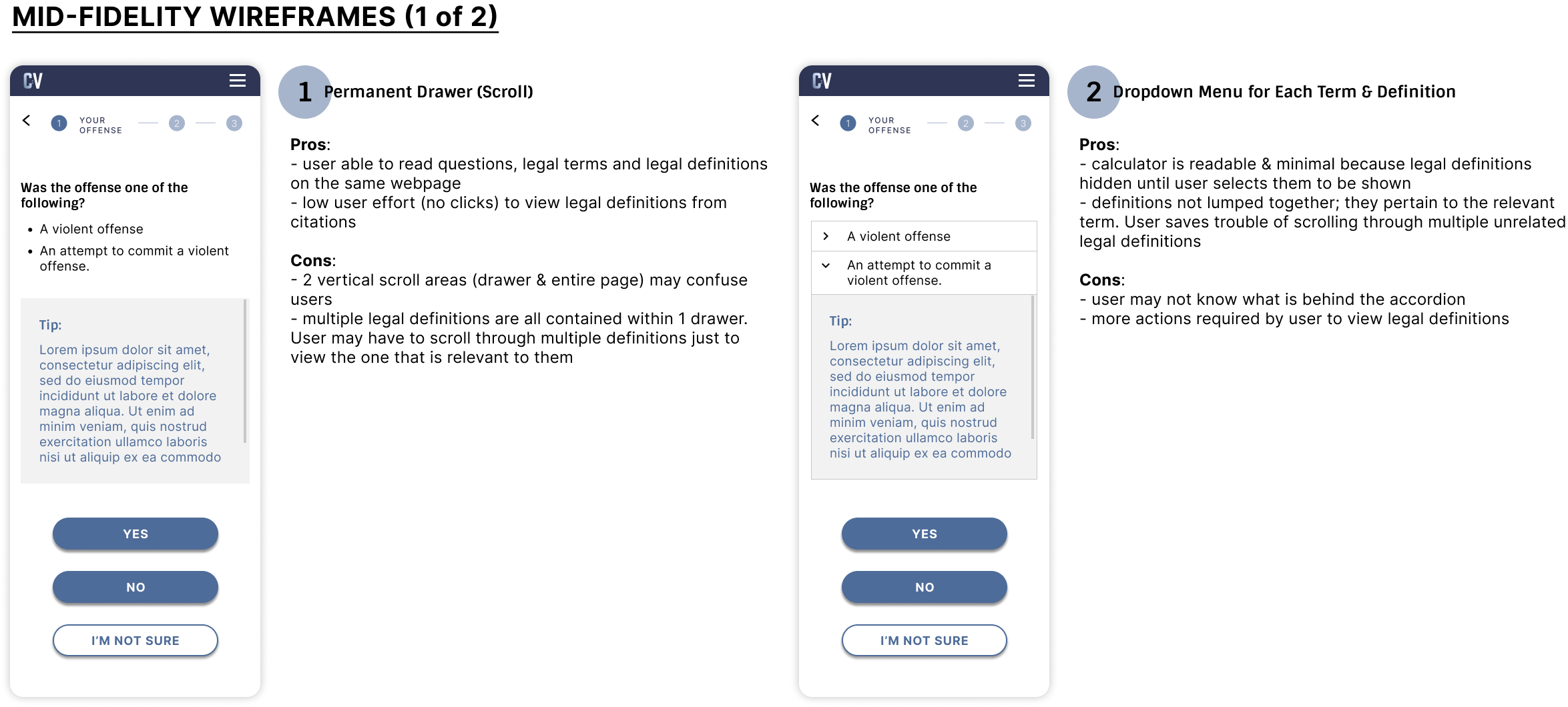
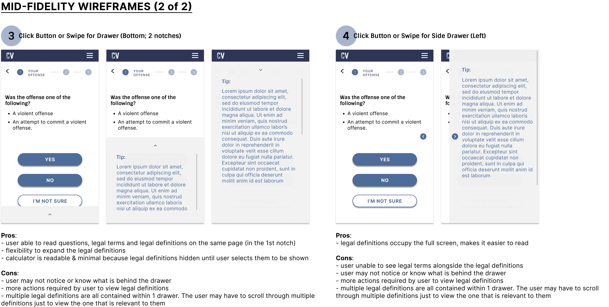
Establishing guiding principles
I conducted a comparative analysis with competitors in the same space to glean learning points that could be factored into my design. I found that all of them looked as complex and intimidating as Clearviction. Pertinently, I learned that my design should:
- Avoid context switching: enable users to refer to legal definitions on the same page as the calculator, instead of being redirected to a new webpage
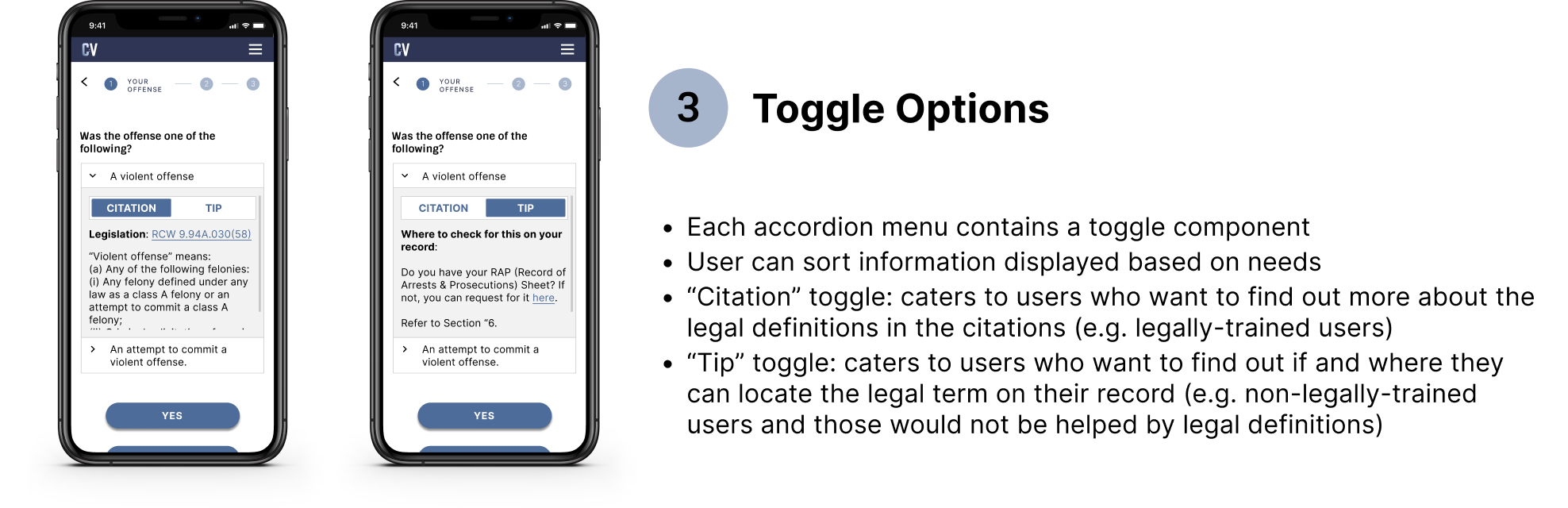
- Keep it simple: prioritize readability and display clarifications only when needed
With these requirements in mind, I created mid-fidelity wireframes for peer review with the product owner.
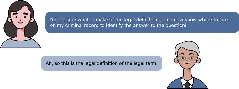
What are users real needs?
With constraints around paraphrasing legal terminology, I considered how to meet the goals and needs of both personas (legally-trained and non-legally trained). As an ex-attorney, I knew that most non-legally trained users (like my clients) wanted easy-to-understand tips and solutions, not clarification on legal terms through legal definitions.
I had to design a solution that would be customisable to the different needs of our personas.
Solution
The Final Product
Reflections
Next Steps
- I would conduct usability testing to validate my design decisions. Due to the nature of the product and its intended users, Clearviction's process is to conduct usability testing once every few months, instead of for every redesign or new feature. In addition to usability testing, the team uses Google Analytics to inform future iteration opportunities. I will be looking out for these insights to guide the next iteration.
- Clearviction is also in the process of brainstorming future product ideas to enhance the user experience on our product, including recommended search technology.
What I learned
I loved working on this project because I was able to apply my past legal experience with UX design. My background gave me an understanding into the motivations and needs of our users and to design a solution that would add value to both.
view other projects
NodeFlair: Company Profile pageUX Design Internship (2022-2023)
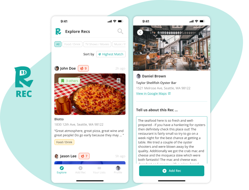
RecEnd-to-end iOS Mobile App MVP (Student Project)
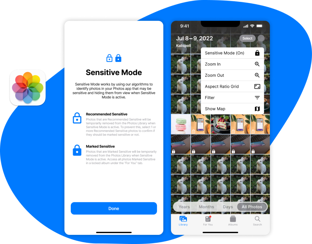
Sensitive ModeAdding a new feature to Apple Photos (Student Project)