INTERNSHIP - GROWTH
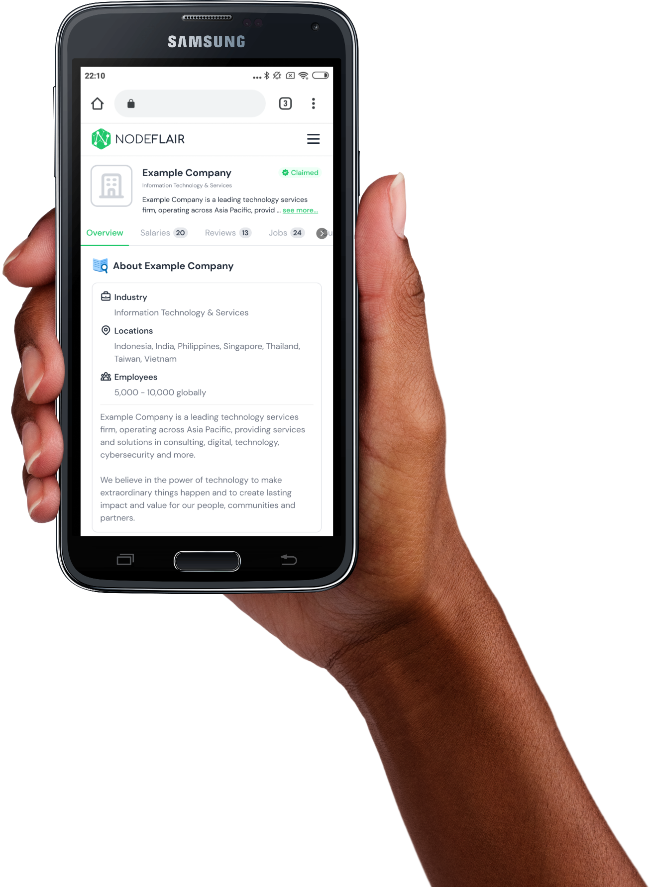
NodeFlair: Company Profile page
Responsive mobile-first web design.
Redesigned the NodeFlair Company Profile page to improve SEO, reduce bounce rate
and increase conversion rate.
Team
Adrian G (Product Lead, Co-Founder)
Faizal M (Lead Designer)
Xinming L (Software Engineer Intern)
Yong Jie (Software Engineer Intern)
Tools
Figma
Timeline
4 weeks, Spring 2023
Who is NodeFlair?
NodeFlair is a Singaporean startup whose mission is to empower tech talents to make smarter career decisions. NodeFlair does so through features on its career transparency platform:
NodeFlair facilitates career transparency by providing unique insights including user-submitted salary data, user-submitted reviews, and articles & reports. Since part of the insights that NodeFlair provides is obtained from user-submissions, it is integral that NodeFlair retains and increases its user base to be able to continue receiving more user-submitted data.
Brief
My task was to redesign the Company Profile page to boost its SEO, user engagement and user conversion.
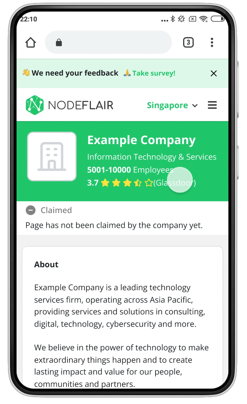
Problem
Through user research, we discovered the problems of inefficient and unimpactful UI and navigation design. We also discovered that the call-to-actions were ineffective and not compelling enough to drive user conversion.
Research
Business Goals
I spoke with the Product Lead and Lead Designer to gain a better understanding of the business goals and metrics for this project. I was also able to gain alignment and clarity on the company's plans and expectations that would affect my redesign (for example, understanding the business' USP, effort required to compile certain types of information, etc).
Biz Goal 1
Boosting SEO means desiging in a manner that increases our rankings on search engines, which leads to increased user traffic and page views
Biz Goal 2
Increasing user engagement means increasing average time on page by keeping users on the platform for longer, and lowering bounce rate
Biz Goal 3
Increasing user conversion means increasing the amount of users who submit their Salary Data and Company Review on our platform
User Goals
I conducted user research to understand users' expectations and behavior when using the Company Profile page. My findings were:
1. There are 2 main user types: exploring users and task-focused users
2. Users did not find the current design useful in accomplishing their tasks
3. Users are unlikely to contribute their Salary Data or Company Review because it is not top of mind and there is little incentive to do so
Pain Points
1. Layout & Content not catered to main user types
 Visually complicated and overwhelming Users not able to easily get an understanding of the company Infinite scroll creates feeling of never-ending information Users cannot easily navigate between sections of content Lack of clear visual distinction between sections makes it difficult for users to read and locate content
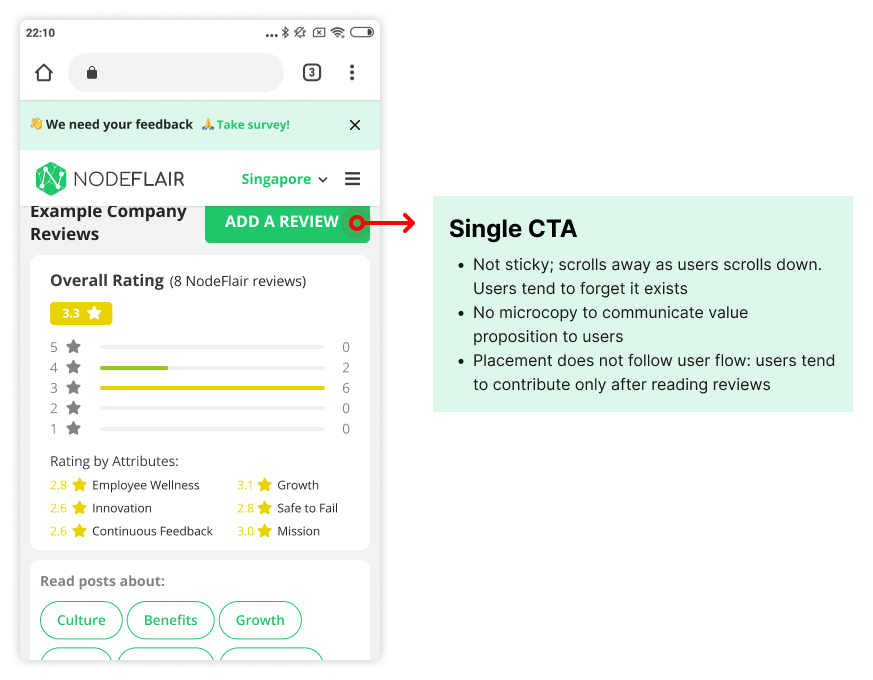
2. Ineffective CTA
Not prominent Microcopy not compelling Bad placement Does not redirect users to other relevant content
Ideation
I adopted a mobile-first approach when designing to optimize SEO and provide for responsiveness.
1. Layout & Content not catered to main user types
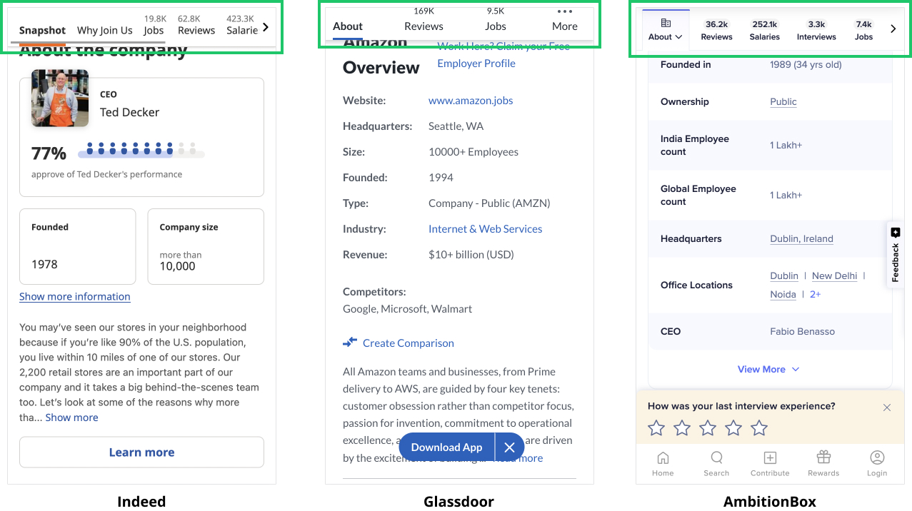
I conducted competitive analysis of similar platforms to gather inspiration and assess their designs. The takeaways that I gleaned are:
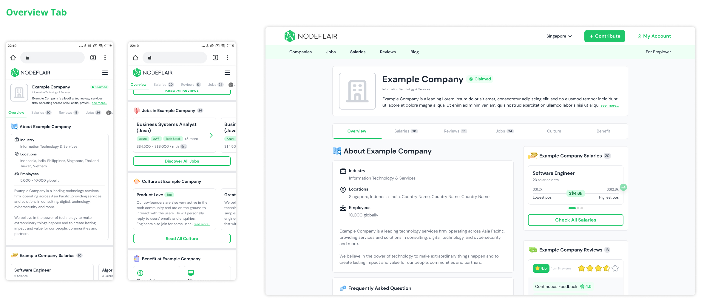
 Breaking content into tabs keeps content categorized into neat chunks, and page scroll minimal Using a sticky navigation bar enables users to navigate content and their current location on the page A "Snapshot" tab gives an overview of all the information on the page
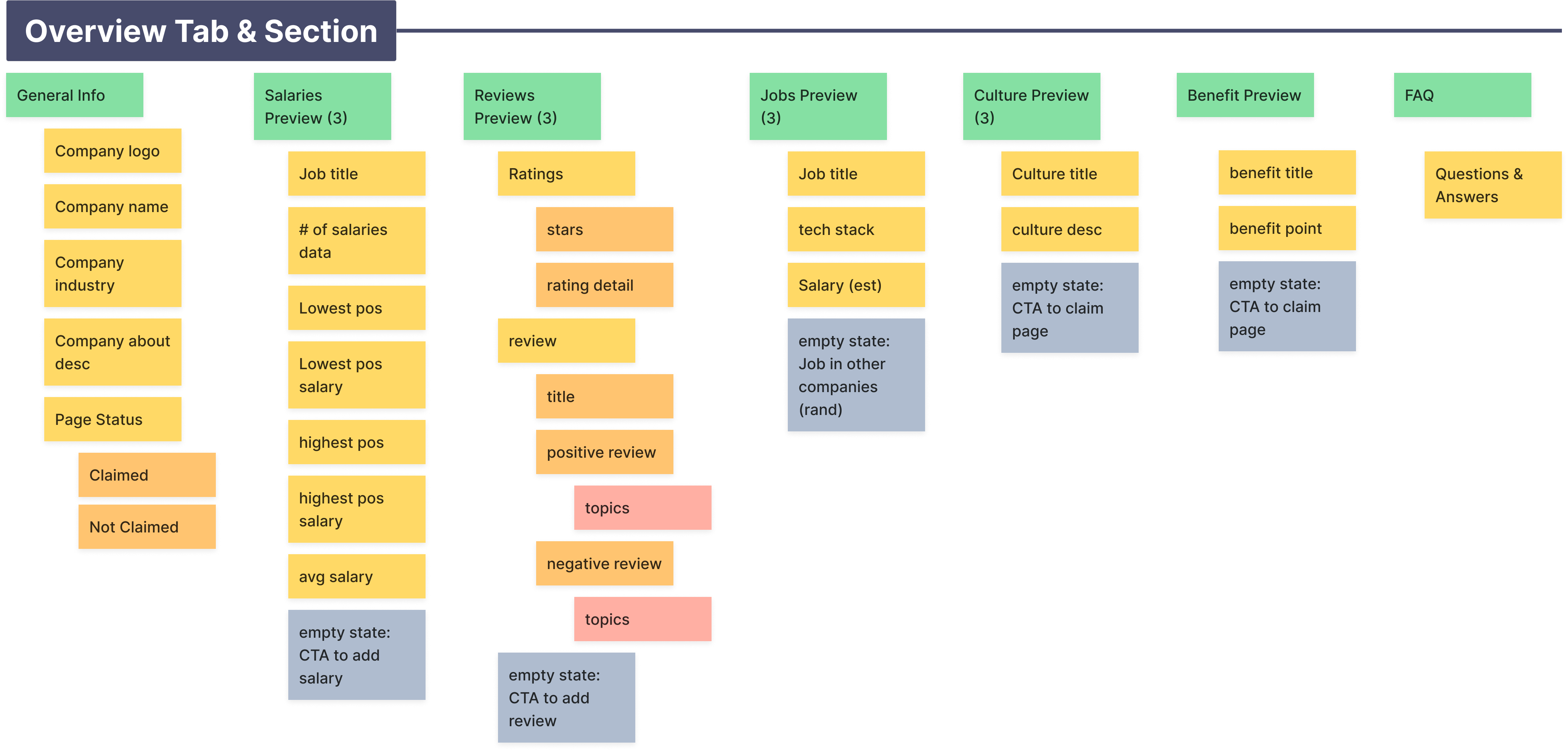
With these insights, I proceeded to map out the current information architecture on the Company Profile page to:
Group and shift related content for each tab Conduct a content audit to remove redundant or unnecessary content Consider new content to be added into the page
Discuss the information hierarchy
I collaborated with the Lead Designer to test some wireframes...
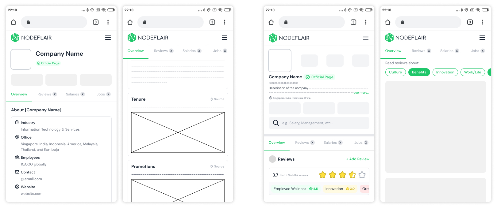
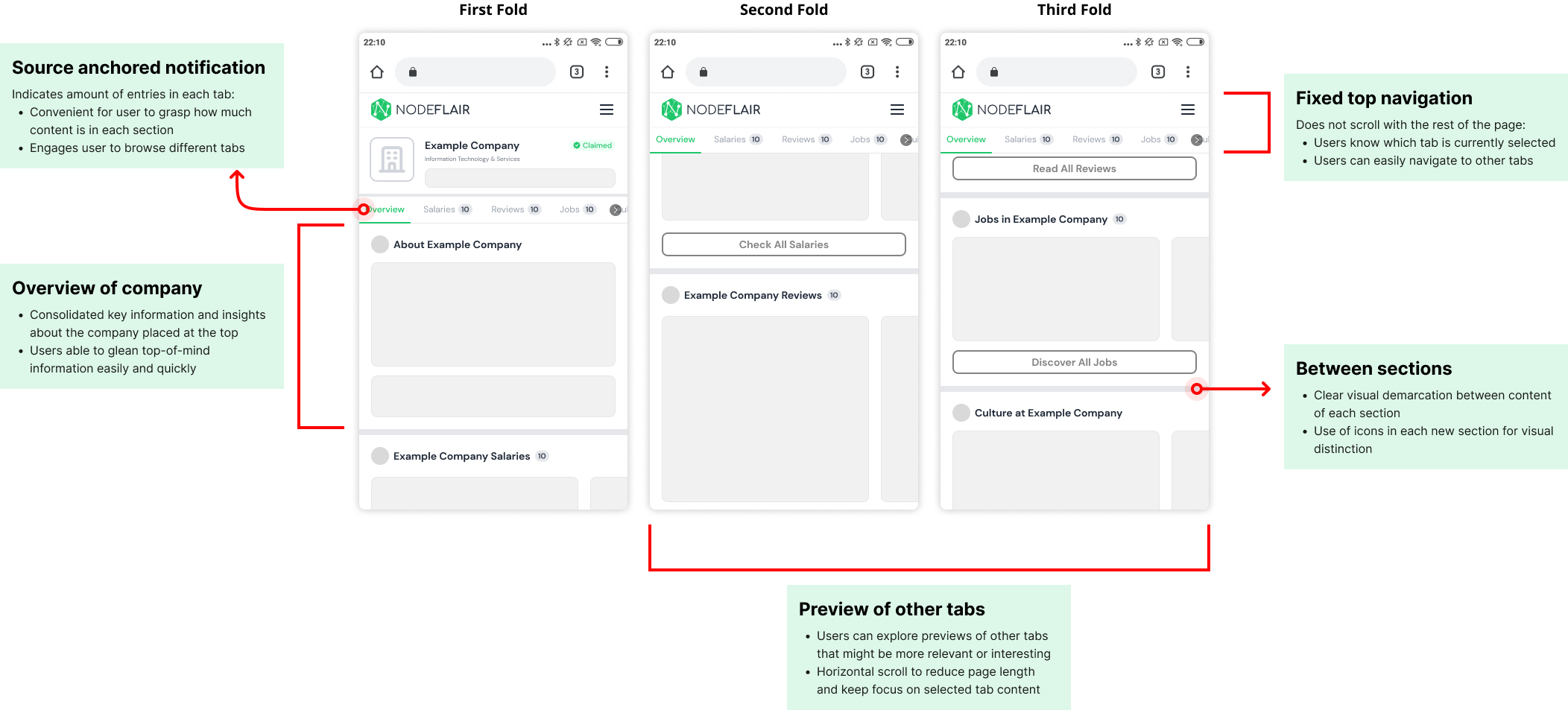
After testing a few variations, we landed on this wireframe. The new Company Profile opens with the "Overview" tab, which prioritizes user's top goal (based on user research) of getting an overview of the specific company. Previews of the other tabs are also included in the overview to give users a high level of flexibility and direction to conduct more in-depth discovery of other sections about the company. These previews sections also have a horizontal scroll interaction to keep the page length to a minimum, so that the page does not feel overwhelmingly long.
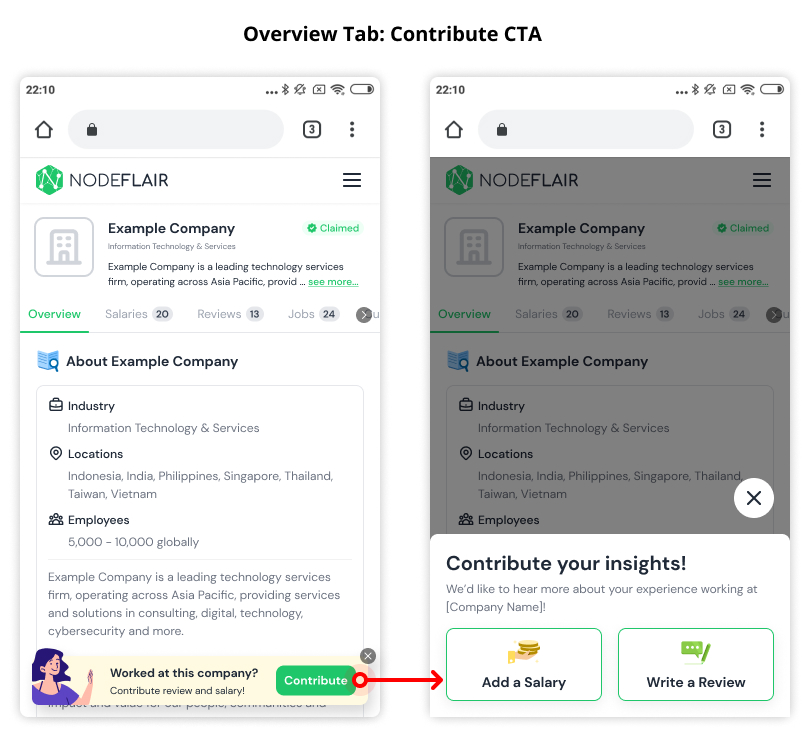
2. Ineffective CTA
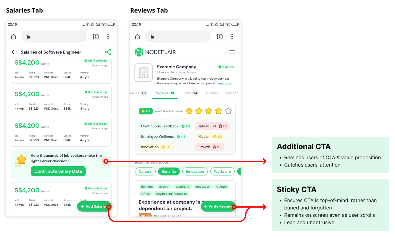
Add Salary or Write Review
I conducted competitive analysis and research to gather inspiration on the CTA redesign. A crucial element of CTAs are their placement on the page - in particular, CTAs should be positioned in a logical manner within the user's journey.
Based on our user research, contributing Salary Data or Company Review was not a primary goal for them when visiting the Company Profile page. As such, I emphasized reminding the user at different junctures of their user journey to contribute their data. In addition, I used microcopy that identifies the benefit of the CTA, to incentivize or encourage users to contribute their data.
CTA: Before
CTA: After
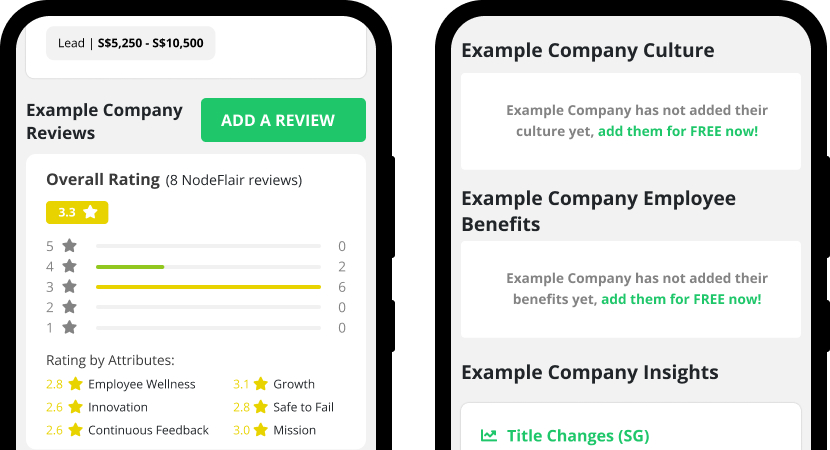
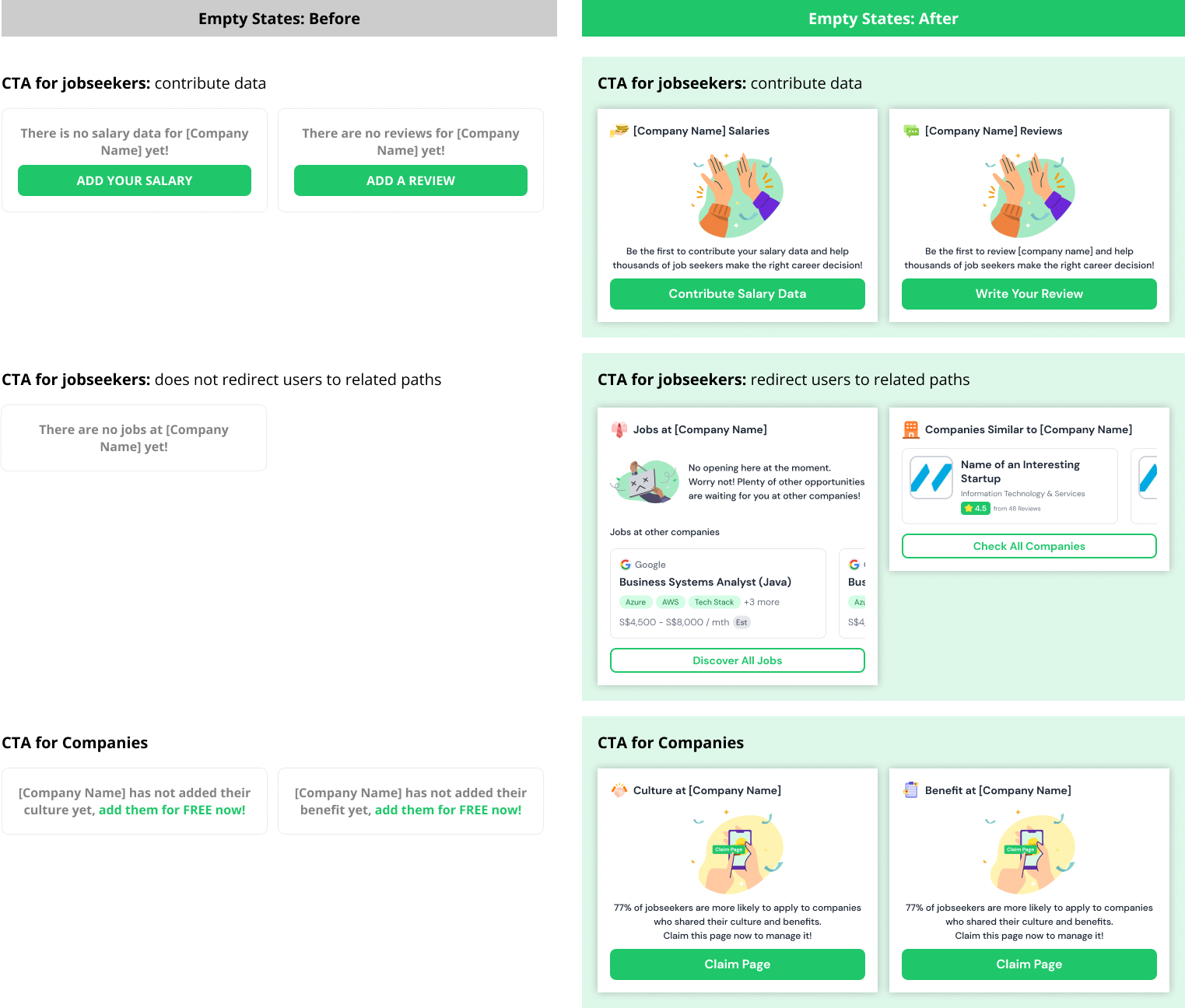
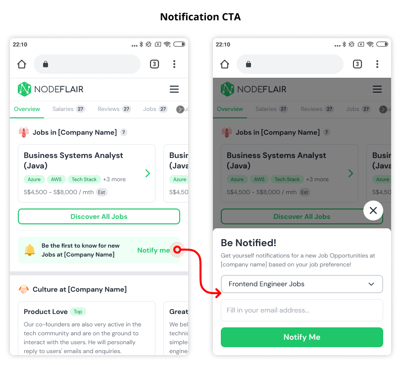
Empty States
The current empty states were under-utilized and missed opportunities for user conversion and engagement. Empty states are opportunities to communicate the system status, help users discover and learn other features, and to provide direct pathways to related tasks. In my redesign, I used eyecatching visuals to increase the prominence of the CTA, and wrote succinct value proposition microcopy and clear CTAs.
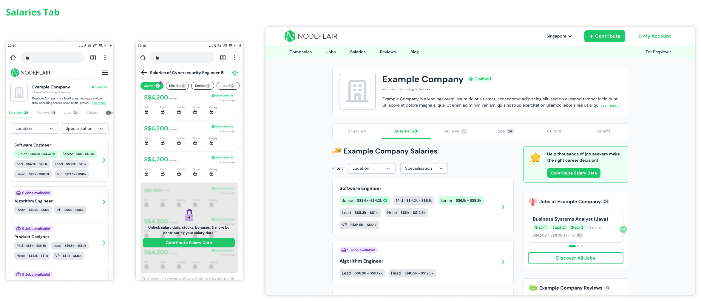
High-Fidelity Wireframes
1. Remaining Tabs
After designing the "Overview" tab, we continued to iterate the design for the other tabs in the Company Profile page. Our objective was to refresh the UI to make the content more engaging and valuable to users.
2. Responsiveness
After designing the wireframes for mobile, we translated them into a responsive desktop wireframes. I tested and discussed several versions with the Lead Designer before we arrived on the final design.
3. Handoff
Before handing off the wireframes for development, the Lead Designer and I created wireframes and annotations to clarify hover and scroll behavior, dropdown menu, active states, modals, etc.
Next Steps
1. User Feedback
With more time, I would conduct user testing on the redesign to understand how users interact with the new interface and any feedback they may have. I would also track the metrics data to see if there are quantitative improvements from the redesign.
2. Additional features
Given that we adopt an iterative design process, we were constantly brainstorming new features or iterations to improve the page. After handing off the above Company Profile page redesign, my Lead Designer and I were working on additional features to increase user retention and conversion.
Reflections
I am thankful to have worked alongside the team to take on this massive redesign project. I learned to collaborate with other stakeholders like the Product Lead, Lead Designer and engineers throughtout the design process. I was challenged to think outside the box, and present my ideas to the Product Lead and Lead Designer.
view other projects
RecEnd-to-end iOS Mobile App MVP (Student Project)
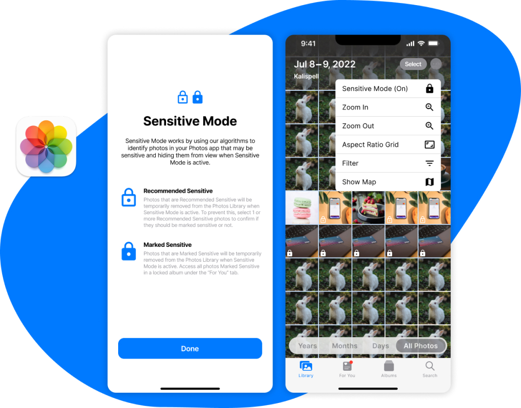
Sensitive ModeAdding a new feature to Apple Photos (Student Project)
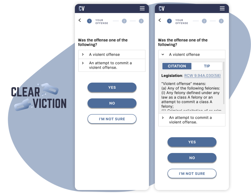
ClearvictionMobile redesign of conviction vacation calculator (Pro-Bono)